
Blossoms Bookhouse, a beloved bookstore in Bangalore, had little to no online presence, relying on a generic e-commerce site that failed to capture its rich history and community-driven charm. Key offerings, like the MyFive Membership program—which allowed customers to return books for a 50% discount on their next purchase—were completely missing from the digital experience. With COVID-19 reducing foot traffic, the bookstore needed a strong online identity that translated its unique offerings into an engaging, user-friendly digital platform.
To address these challenges, I conducted a UX Audit to identify usability issues and a Competitive Analysis of four bookstores—two direct and two indirect competitors—to benchmark best practices. I also conducted user interviews to understand how customers browse, buy, and engage with books. Using these insights, I:
The new website established a strong digital identity while making book browsing and membership tracking seamless.
Key features included:
Click here to jump straight to my final design.
Blossoms Bookhouse, a cherished independent bookstore in Bangalore, had little to no online presence, relying solely on a bare, generic e-commerce site that failed to reflect its rich legacy and community-driven charm. The website lacked branding, storytelling, and an engaging user experience, making it indistinguishable from any other online book retailer.
A major gap was the , which allowed customers to return books and get 50% off their next purchase—a unique offering that had no digital translation on the website. With foot traffic declining during COVID-19, the bookstore needed a strong online identity that not only showcased its curated book collection but also made the BookReturn program accessible and intuitive for users.
In reviewing the current Blossom Book House website, I identified multiple areas for improvement to better reflect its brand identity and optimize the user experience.
Lack of Branding and Visual Identity: The site uses a generic e-commerce template that limits branding opportunities. With no unique colors, typography, or layout, it feels disconnected from the distinctive identity of this well-known bookstore.
Information Gaps: Only the title and author’s name are shown with each book cover, leaving out essential details like genre, description, and author background. These additions would support users who wish to explore books before purchasing.
Browsing Experience: The product page lacks features to display related books by genre, theme, or author, resulting in “dead ends” where users can only return to the main page. This disrupts browsing continuity, adding unnecessary loading and cognitive strain.

I conducted a competitive audit of similar bookstores in Bangalore, as well as larger online retailers, to benchmark features and gain insights.

Using a detailed checklist, I evaluated key aspects such as competitor type, locations, product offerings, business size, target audience, unique value propositions, first impressions on both desktop and mobile, interaction flow, key features, navigation, brand identity, and content tone.

This analysis helped me identify strengths and gaps in competitor designs, guiding my approach to enhance usability and align with Blossom Book House's unique brand in my redesign.
Since this project was during COVID-19, I had limited chances to conduct in-person interviews with customers at Blossom Book House due to fewer visitors and understandable hesitancy toward interactions. Nonetheless, I’m grateful for the eight brief interviews I was able to conduct, which offered valuable insights.
Many customers emphasized the importance of physically exploring a book’s back cover and sample pages. They noted that current websites only offer cover images, which made it challenging to feel confident in their purchasing decisions without more in-depth information.
Blossom Book House has a unique business model that allows members to return any number of books from their purchase and receive a 50% discount on their next purchase, based on the amount of the returned book(s). For instance, if a member buys five books and returns one, their next purchase will have 50% off the value of the returned book.
I designed the MyFive Membership Dashboard to help users track and manage their book returns while seamlessly applying their 50% discount on future purchases. The dashboard provides a visual representation of the five books currently linked to the user's membership, making it easy to see which books are eligible for return.
Users can effortlessly move books in and out of their MyFive list, with an "Undo Move" option to prevent accidental actions. The interface also integrates wishlist recommendations and a dynamic swap list total, ensuring a smooth and intuitive experience for managing book exchanges. This feature brings the unique MyFive membership model online, making it more accessible, transparent, and user-friendly.
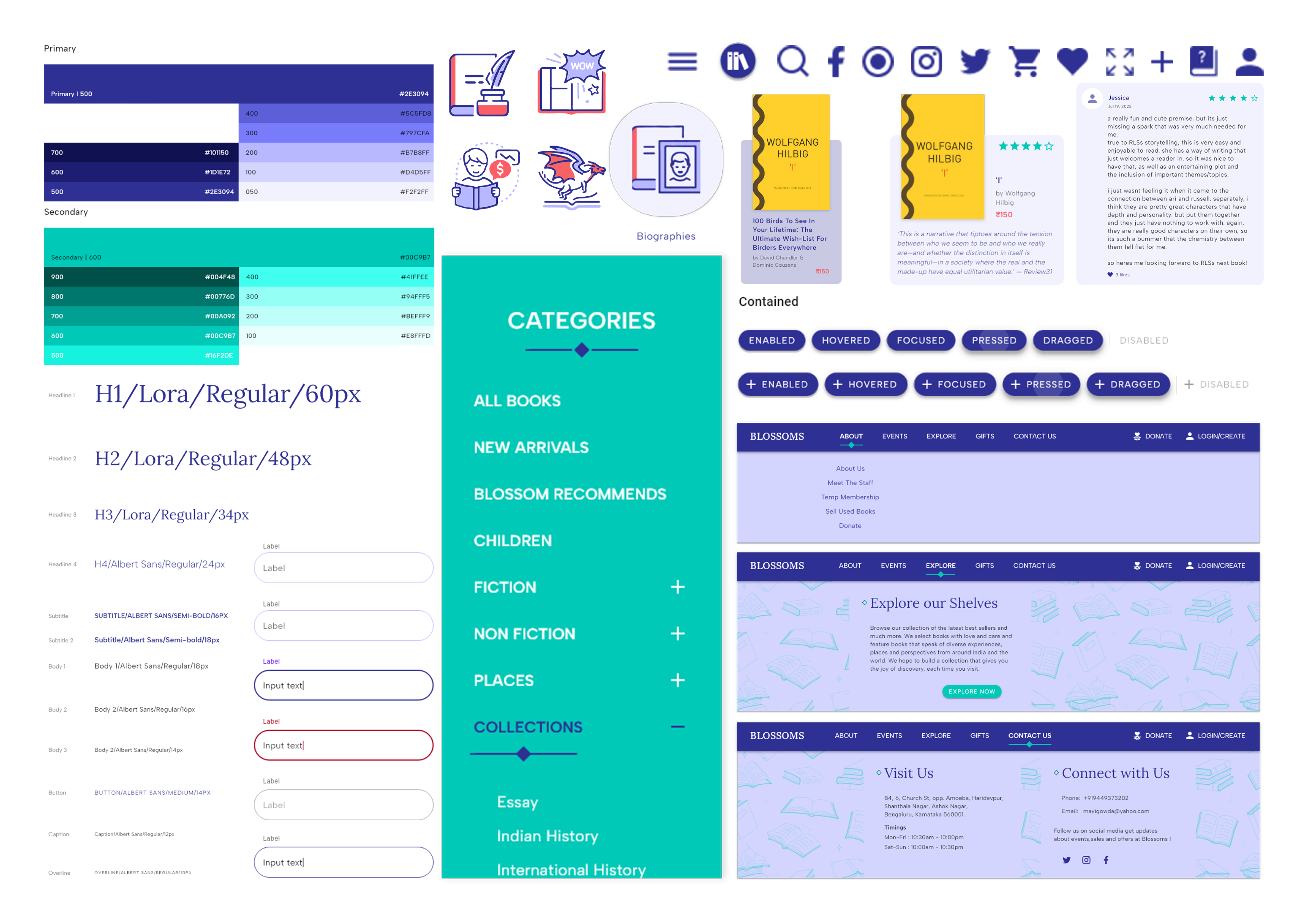
Building on these insights, I developed a comprehensive style guide and design system, drawing inspiration from the Blossoms Bookhouse logo to create a cohesive and brand-aligned visual identity. Additionally, I analyzed the site mapping of the existing website and its competitors to strategically plan an optimized site structure for the redesign. Prioritizing accessibility and usability, I designed the Home Page to serve as a central hub, providing seamless access to key sections and features.
To minimize loading times and cognitive load, I implemented intuitive interactions such as pop-ups and overlays, ensuring that users could access essential book information without unnecessary navigation or disruptions. This approach not only streamlined the browsing experience but also reinforced a visually engaging and user-friendly digital presence for Blossoms Bookhouse.
The Home Page highlights Personalized Staff Picks & Related Books, designed to enhance engagement and encourage exploration. To further foster a sense of community and connection, I incorporated an Event Listings section for author signings and book launches, along with a Gift Section featuring curated book boxes and gift certificates. These additions create a more immersive experience, making the website not just a place to buy books, but a space to discover, engage, and connect with the literary community.
In my design, I streamlined journey from book browsing to checkout. The Pop-up Book Info Cards allow users to preview essential book details without leaving their browsing flow, reducing friction in the discovery process. The interaction flow showcases how users can add books to their cart directly from the pop-up and proceed effortlessly to purchase, making the buying experience faster, more intuitive, and engaging.
The individual book page, was designed to provide users with comprehensive book information. The page includes a detailed book description, an "About the Author" section, and community-driven reviews, allowing users to gain deeper insights before making a purchase. Users can contribute their own reviews, fostering a reader-driven engagement system that enhances trust and book discovery.


